When you amble down to the local station of a morning, there are certain things you'll probably want to be sure of before you board your train. Knowing where it's going would be good. Some idea of how long you're likely to be waiting would be nice too.
Something you're probably slightly less concerned about is which particular set of shareholders are entitled to the dividend that your journey generates. This, though, is the piece of information that London's new rail map seems most concerned about transmitting to you.
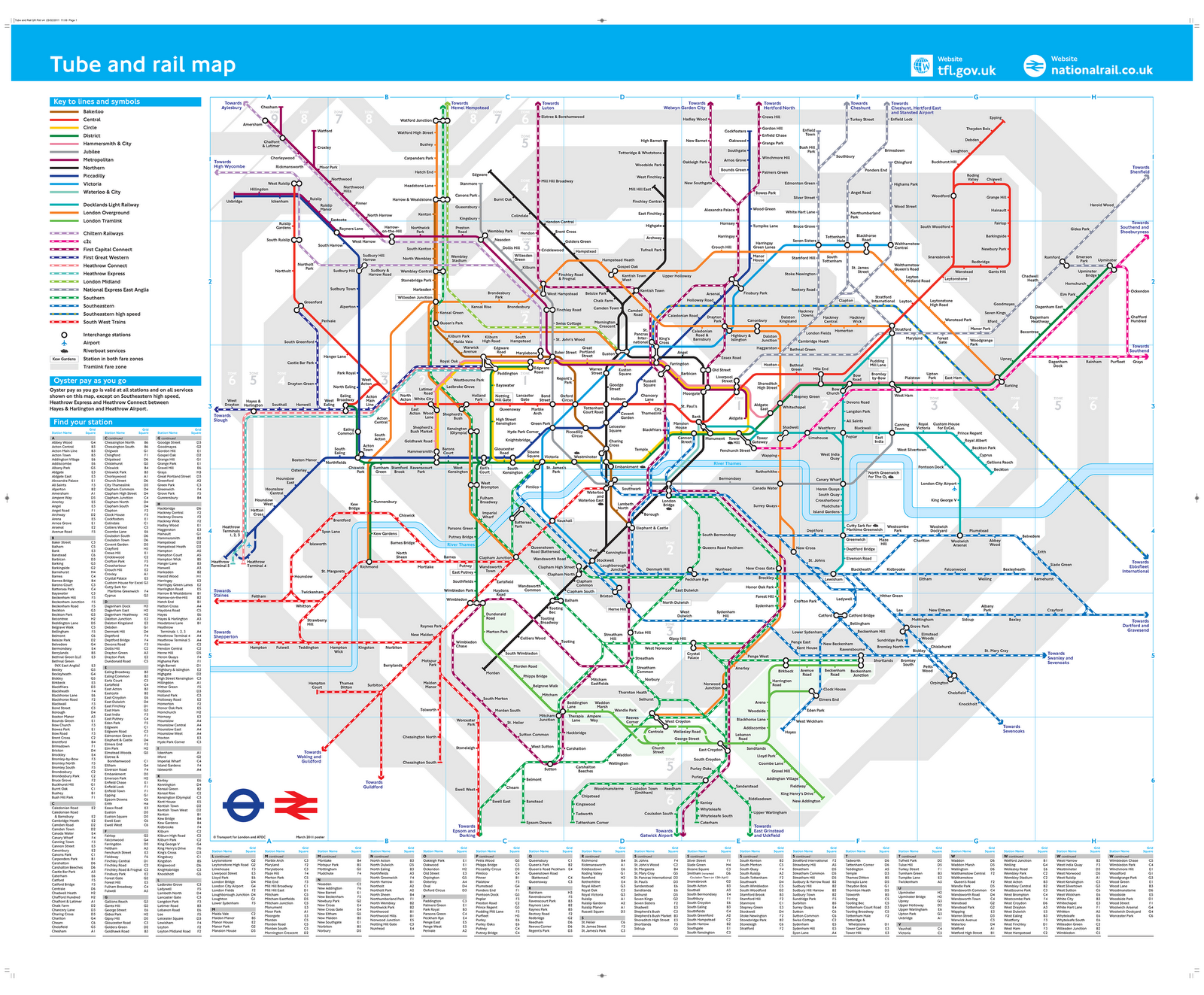
The new Tube and Rail Map replaces the Oyster rail map, which replaced the high frequency services map before it. It’s the result of an agreement hammered out between TfL and the Association of Train Operating Companies, and it should soon be showing up at every station in London, whether train, tube or tram.
That's a pity. Because it's rubbish.
It isn't the fact that it's ugly that's the issue (although it is, astonishingly so). No, the problem is that it’s done away with whole chunks of useful information.
For one thing, it’s oddly silent on how regularly the trains run, so that you can never be sure whether a line offers tube-level frequencies or one service a week.
More importantly, though, it's abandoned the practice of colour-coding lines based on which stations they run into. Instead, they’re coloured based on which train operating company (TOC) is currently running the things.
North of the river, the routes only tend to go to one terminal anyway, so this doesn’t really matter (even if some of the colour choices suggest that the map was designed by a particularly poorly sighted bat). South of the river, though, it's more problematic.
The new map is helpful if you want to know which group of semi-competents are to blame for the cancellation of your train this morning (and we bet it's Southeastern). But it's not much use if you want to know whether you can get a direct train from Hither Green to Victoria. Which you can't.
But then, why would anyone need to know a silly little thing like that?
It's not all bad: the decision to colour-code by company will, at least, be useful for those whose season tickets are only valid on certain company's trains. And the terminal-based system did seem unable to cope with the confusion caused by those trains that run into both London Bridge and Victoria.
Nonetheless, it looks suspiciously like the new version has sacrificed information about London’s transport network that's actually useful, in favour of sticking to the correct corporate brand identity. Because that, of course, is what really matters. Those of us who use the trains are, as ever, in no doubt as to where we come in the TOCs' priorities.


