London In Comic Sans

M@
By M@
London In Comic Sans
Time to ditch New Johnston. Doesn't the tube roundel look soooo much happier in Comic Sans?

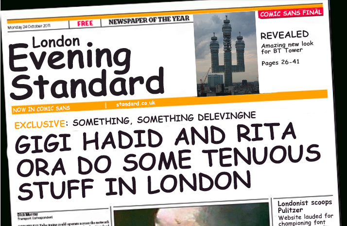
Comic Sans — it's the stuff of children's party invitations, community jumble sales and slightly confused emails from your Great Uncle Nigel. Absolutely nobody has ever expressed a negative opinion of this most joyful, versatile typeface. It is universally loved. Shut up.

We hereby launch a campaign to replace all the tired typefaces of London with this humble yet dignified font set. The future is bright; the future is Comic Sans.

Big Ben clock face with Comic Sans numbers instead of Roman numerals.
They told us Big Ben was under wraps for essential repairs. In fact, clock workers are installing these Comic Sans numbers to help Millennials who can't read Roman numerals. It's about time.
If ever a brand needed updating to look less stuffy and exclusive... Comic Sans is the answer. Comic Sans is always the answer.
The classic Westminster street sign, designed decades ago by Sir Misha Black, is in need of a refresh. Time to adopt a typeface that better reflects the way Britain is perceived on the world stage. That typeface, once again, is Comic Sans. Background image: Shutterstock.
Goswell Road street sign.
The Square Mile's signs are even more amenable to our favourite font. This makes us actually want to go to Goswell Road.
A London telephone box.
Ring in the changes: all K2 phone boxes should be updated to Comic Sans. It was the favourite typeface of Sir Giles Gilbert Scott. Fact.
Lionel Stanhope should be using Comic Sans for his south London rail signs. See how much stronger the design looks with jaunty, impish lettering.
Britain's road signs are largely unchanged from the designs laid down by Jock Kinneir and Margaret Calvert in the 1960s. We know how we'd update them. Image N Chadwick, creative commons.
Evening Standard front cover.
Even the London media shall bow down to the all-conquering typeface.

Last Updated 20 February 2024