Ah, the Tube Map. It may be nearly 90 years old, but the elegant simplicity of its topological design continues to inspire many a Londoner. So many, in fact, that we've been compelled to put together another roundup of our favourite spins on Harry Beck's iconic creation. Enjoy!
1. The Human Anatomy Map

Brush up on human biology with the help of Jon Simmonds, MD and his anatomical tube map. The masterful attention to detail here is pretty mind-blowing, and we particularly like the creative use of travel zones to flesh out his humanoid figure.
2. The Beijing Subway Map
Ever wondered what the tube map would look like if the network was shaped like the Beijing subway? Nope, us neither... at least, not until map maverick Alistair Carr brought this nifty little design into our lives. Here's the gist of it: the grid-based Chinese metro is overlaid on geographical London, with Tian'anmen East station corresponding to Trafalgar Square. Everywhere you'd find a station in Beijing, the map shows what would appear in the corresponding London location. Simple as.
3. The Waitrose v Lidl Map
Here's a map that's both interesting and practical. Not only is it an at-a-glance guide to grocery shopping near you, it's an intriguing reflection of London's socio-economic make-up. Waitrose, the well-heeled shopper's supermarket of choice, dominates in central London, as well as the affluent west — residents from Addleston to West Hampstead can rest assured that they'll never be short of such essentials as artichoke hearts and crème brûlée. Conversely, cheap and cheerful Lidl is much more prevalent in the traditionally less wealthy East End.
4. The London Salary Map
Neighbourhoods like Hackney and Kentish Town may be Waitrose-less, but you'll nevertheless need to be raking in an annual salary that's over twice the national average in order to afford your own home there. This map of London salaries for property hunters makes for a fascinating — albeit sobering — read.
5. The Alternate History Map

Take a look at what could have been with a tube map based on post-second world war proposals that failed to to take off. With brand new lines taking you all the way from Ally Pally in the north to Epsom Downs in the south, it's truly the stuff a modern day commuter's dreams are made of.
6. The Map of the Future

Let's quit focusing on the past and see what the future may have in store. As the TfL network continues to expand, so too will the tube map. Redditor u/Not_Quite_Vertical has pulled off quite the feat for his take on what that might look like: maintaining the clean, slick look of the current iteration despite adding two new lines and loads of extensions.
7. The Slimmed-Down Map
Notice anything different about this Tooting resident's rendering of the tube map? It's less bendy, for one thing. To make room for Crossrail, Jonathan Farrow has ironed out the kinks in the Central Line and the Overground, as well as adding a cheeky bit of the Thameslink for the benefit of his fellow south London commuters.
8. The Inside Out Map

If you're fed up of the snide implications that your Zone 5 abode is not 'proper' London, then you'll love this inside out tube map. The likes of Covent Garden and Holborn are relegated to the map's periphery, while Morden, Upminster, and High Barnet take centre stage.
9. The Haunted Hotspots Map

Go on ghost hunt with the help of the tube map that charts London's phantom population. Our very own Editor-at-Large Matt Brown came up with this ghoulish guide, which features everything from weeping women to spooky squirrels.
10. The Tudor Map

Another classic from Matt, the Tudor London tube map is perfect for history buffs. We can just picture Robert Dudley having a moan over yet another delayed District line train derailing his commute home to Eltham Palace...
11. The Avocado Map

Proceed with caution: if the tabloids are to be believed, a dangerous proclivity for avocados — rather than the ridiculous salary requirements detailed on Map 4 — are scuppering millennials' chances of becoming home-owners. Really, then, a map detailing London's hass hotspots must to be the last thing you need.
12. The Secret Map
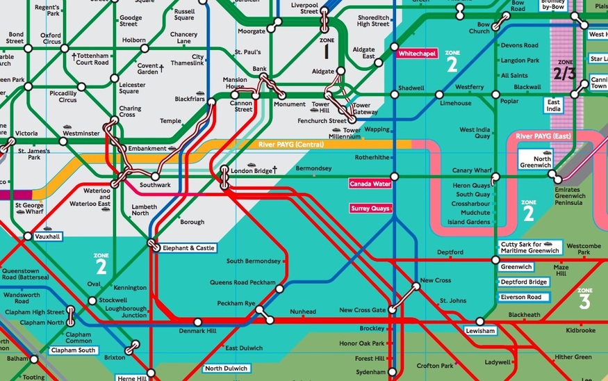
This map was available on a strictly on a need-to-know basis, having been locked away in TfL top secret map cabinet (or so we imagine), until a Freedom of Information request brought it into the public eye. Wondering what all those zany colours mean?
The block backgrounds signify which fare zone you're in, while the green, blue, and red lines represent lines that charge tube fares, other TfL fares, and the pricier National Rail fares, respectively.
13. The Brutally Honest Map

Journey from the buzzing neighbourhood of Fashion Twats (Shoreditch) to the bustling streets of Ineffable Sadness (Queensway) with the help of this rather rude tube map. Why not see how many stations you can correctly identify without cross-comparing with TfL?
Hungry for more? Check out some of our old favourites here.


