
Join us to chat about all things related to London transport on our new Facebook group, Londonist Roundel Ramblings — everyone welcome.
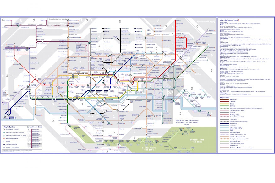
Londoners are a creative bunch. Barely a day goes by without another alternative tube map appearing (seriously — here's one we shared just yesterday).
Today's offering comes courtesy of Jonathan Farrow, a Tooting resident whose main aim was to make the tube map a little less kinky (ooer), doing away with unnecessary bends and twists, making more space for the arrival of Crossrail.

The Northern line, rather than being two separate lines (which, let's be honest, it essentially is), is designed as a straight line on the Charing Cross branch, with the current Bank branch from Euston to Kennington appearing as a crescent off of this.
If the Northern line is the new vertical axis of the map, then the Central line is its horizontal counterpart. Rather than wiggling its way drunkenly down from Liverpool Street to Bank, then back to Holborn, then down again at Queensway, the red line stays straight from Bank, all the way out to East Acton.

The Overground too, has been straightened out in several places, and we have to say, it's a lot easier to follow than the original — TfL could learn a thing or two here.
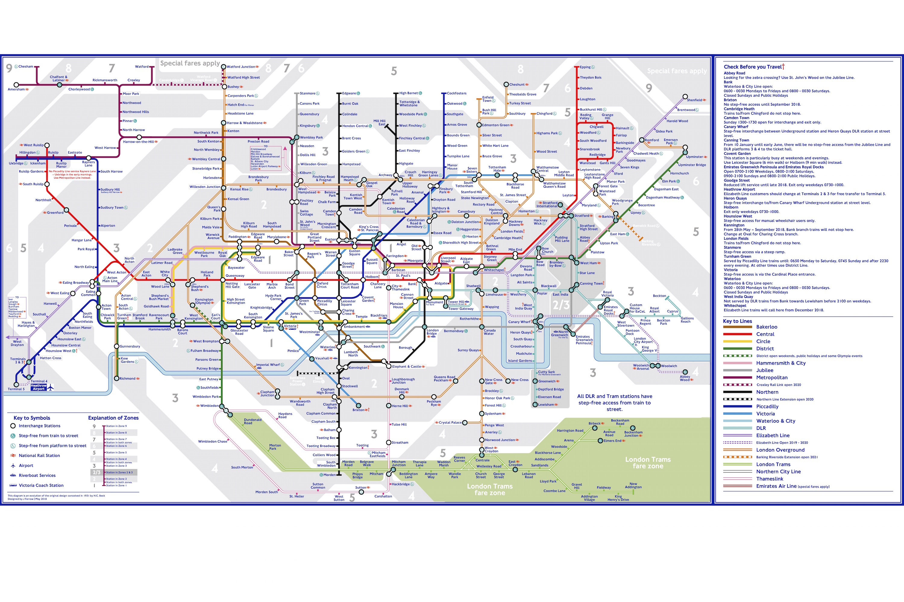
Over on yellow, the Circle line retains its recognisable bottle shape, but Crossrail's been added (here's what the real tube map looks like with Crossrail added in)
And you might have noticed an extra splash of pink, too. Jonathan says:
I have included the Thameslink southern section as living in Tooting, I find it easier to use to cross London than the Northern line, and is mightily important for south London residents.

The keen-eyed among you will have noticed that it's not just the lines themselves that have had a makeover. The step-free access symbols for non-interchange stations have been removed from the line, and placed next to the station names instead. Jonathan explains:
I feel the current step-free access symbol is used less efficiently than it could be and makes the interchange symbol less prominent; hence why step-free access for non interchange stations is shown in-line with the station name.

Finally, the 'dagger' symbol (we always thought of it as a cross ourselves, but each to their own), which denotes 'check before you travel' has been made more prominent, changed from blue to red. Again, Jonathan has his reasons:
I have been caught out myself with the interchange and exit only at Camden Town station on Sundays and I feel this information is too useful to be left out of the main map design, in the "Check before you travel" section to the right of the map.
Have yourself a thorough look at Jonathan's map to spot what else he's changed — you'll find a larger version here.


