
The London Overground officially opened on 11 November 2007, and here's what the first map looked like:
First thoughts: it's contained and manageable; with just 56 stations, there's plenty of white on the page. At this time, an average of 400 trains ran each day, and during the 2008/9 season, 33 million people travelled on the Overground network.
Something conspicuous: there's no River Thames on this map — a phenomenon which was adjusted soon after. (A similar attempt to drain the tube map of the Thames in 2009 was shortlived. Lesson: do not try to deprive Londoners of their sacred water source, even when it's just a rendering.)
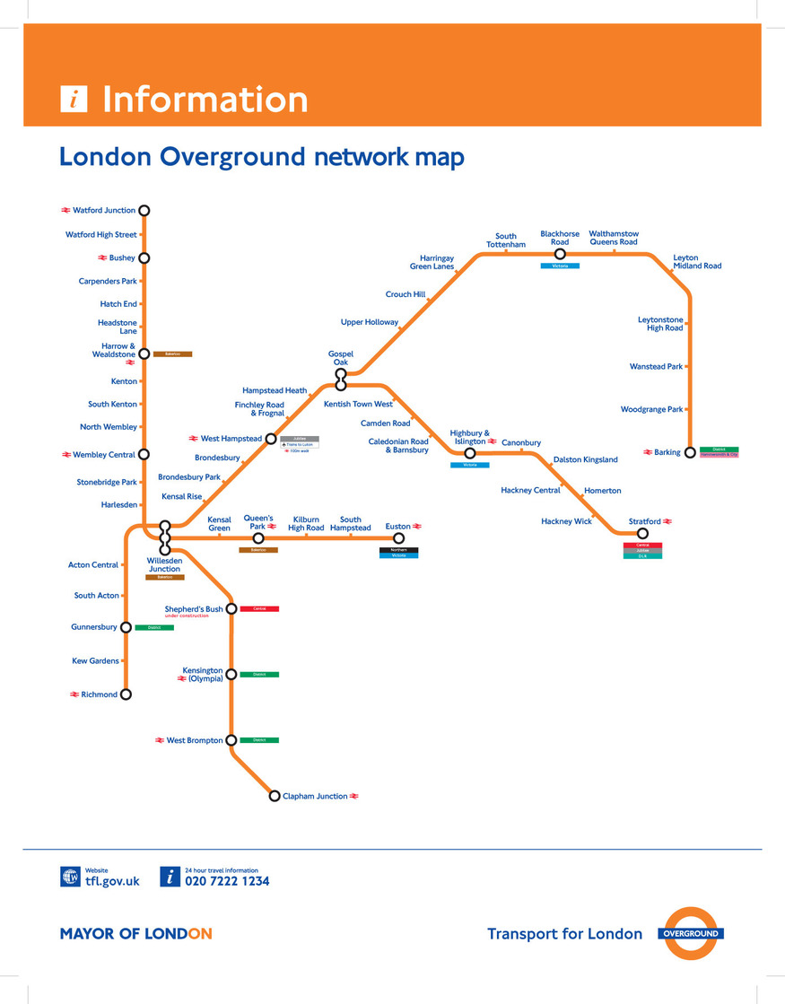
And here's the Overground map one decade later, in 2017. My, how it's grown:

The number of stations has doubled to 112, with swathes of London far and wide now joined up by those bright orange lines (although, you'll notice, no longer a solid orange).
Lines from Highbury and Islington to Willesden Junction to Clapham Junction back round to Highbury and Islington, form a central loop — with new offshoots including West Croydon in the south east, and Enfield Town, Cheshunt and Upminster, in the north east.
In 2017, 1,500 trains ply the Overground network each day, with close to 190 million passengers making use of it in 2016/17. Ironically, since 2007/8, delays have been reduced by more than a third.
Ah yes, the Thames has materialised too, giving us a welcome (if rough) geography of the north-south divide.
As for the future? More sprouting, with Overground extensions to Barking Riverside in the works, and Thamesmead and Abbey Wood being pushed for.

But the Overground's orangey tentacles could one day spread much further — as shown in the hypothetical map above, which shows that the network could reach the likes of Epsom, Letchworth, Shepperton and Gravesend.
At this rate, the Overground map of 2027 could contain more orange than white...


